Create a Card Component Using Chakra-UI

I am a developer from Nigeria passionate about building impactful tech products.
Introduction.
Creating beautiful user interfaces in simple and stress-free ways has been the primary focus of Frontend Engineering in recent times. Although Frontend Engineering can get complex depending on the scope of the project you're working on, being able to do the simple things quickly and without too much hassle goes a long way in contributing to one's overall productivity.
Chakra-UI has been that library in recent times that allows me to build faster and implement most features in a simple way.
In this article, we will scratch the surface of Chakra-UI and learn how to create a simple card component using the library's in-built components. By the end of this article, you'll know what Chakra-UI is, its various benefits, some of the numerous components used in the library, basic styling of components, and putting it all together in a React project.
Prerequisites.
This article assumes the reader has the following:
Knowledge of HTML, CSS, and JS
Knowledge of React and Functional Components
NPM version 8.1 or higher installed on their local development machine.
Note: React version 18.2.0 was used in building the project for this article.
What is Chakra-UI?
As it says on the official website, Chakra-UI is a simple, modular and accessible component library that gives you the building blocks you need to build your React applications.
As Developers/Engineers, we constantly strive to find new ways of spending lesser time doing most of our tasks, and Chakra-UI provides a way to achieve that. Spend less time writing UI code and more time building a great experience for your product and customers.
Benefits of using Chakra-UI.
Chakra UI is a React-based framework that offers a set of reusable and accessible components for building user interfaces. Some advantages of using Chakra UI include the following:
Accessibility: Chakra UI components are built with accessibility in mind and follow the WAI-ARIA guidelines.
Customizable: Chakra UI provides a powerful theme system that allows you to easily customize your application's look and feel.
Lightweight: Chakra UI is built with minimal CSS and focuses on providing a set of functional components, making it lightweight and fast.
Compatible with other libraries: Chakra UI is built with React and can be used with other popular libraries such as Next.js, Gatsby, and more.
Well-documented: Chakra UI provides detailed documentation for each component, including examples and props.
Flexible: Chakra UI provides a variety of components that can be used to build any kind of interface.
Installing Chakra-UI.
There are two ways to install Chakra-UI through Create React App, Automatic and Manual installation.
With Create React App, users can create a project using a template, which determines the files and dependencies included with the generated project.
Automatic Installation.
- JavaScript Template.
To generate the starter template for a JavaScript project, run the command below:
npx create-react-app my-app --template @chakra-ui
- TypeScript Template.
To generate the starter template for a TypeScript project, run the command below:
npx create-react-app my-app --template @chakra-ui/typescript
These approaches are similar to the base create-react-app template but come with Chakra UI dependencies pre-installed and include Chakra-specific functionality.
Manual Installation.
Inside your Create React App project, install Chakra-UI by running the following command:
npm i @chakra-ui/react @emotion/react @emotion/styled framer-motion
Provider Setup.
After installing Chakra UI, you need to set up the ChakraProvider at the root of your application. This can be either in your index.jsx or index.tsx
Put in the following code:
import * as React from 'react'

// 1. import `ChakraProvider` component
import { ChakraProvider } from '@chakra-ui/react'

function App() {
  // 2. Wrap ChakraProvider at the root of your app
  return (
    <ChakraProvider>
      <App />
    </ChakraProvider>
  )
}
And with that, you will have access to Chakra-UI and all its features and dependencies throughout your entire application.
Most of the information here and more can be found on the official documentation website of Chakra-UI.
Building the Card Component.
Now that we have our React App setup and Chakra-UI installed, let's proceed to the main point of this article and build out a simple Card Component to display basic information about an article; the article image, the title, and a sample text.
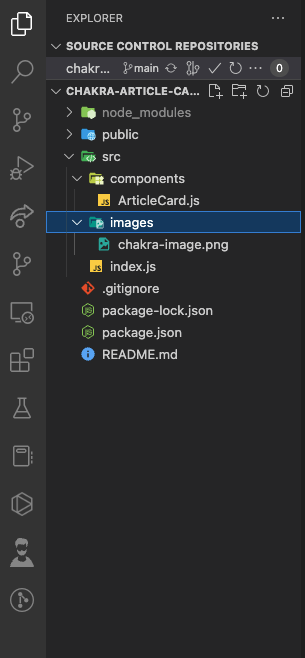
In our React App, we can delete all unnecessary files in the src folder leaving behind only the index.js file.
In the src folder, let's create two folders components and images to house our ArticleCard component and the articleImage respectively.
At this point, the structure of our app should look like this:
In the articleCard component file, copy and paste the code below:
import React from 'react';
import { Card, CardBody, Stack, Heading, Image, Text, Link } from '@chakra-ui/react';
import articleImage from '../images/chakra-image.png';

const ArticleCard = () => {
  const articleTitle = 'Creating a Card Component using Chakra-UI';
  const articleText =
    'Lorem ipsum dolor sit, amet consectetur adipisicing elit. Laboriosam quis a consequatur veniam debitis, iusto, perferendis...';
  return (
    <Card maxW="sm">
      <CardBody>
        <Image src={articleImage} borderRadius="8px 8px 0 0" />

        <Stack mt="6" spacing="3">
          <Heading
            as="u"
            textUnderlineOffset={3}
            color="#292F2E"
            fontWeight={800}
            fontSize="lg"
            lineHeight="tall"
          >
            <Link href="https://emmanueloloke.dev">{articleTitle}</Link>
          </Heading>
          <Text fontSize="sm" lineHeight="taller" color="#949796">
            {articleText}
          </Text>
        </Stack>
      </CardBody>
    </Card>
  );
};

export default ArticleCard;
While explaining the code above, I'll also take the liberty to touch on some of the in-built Chakra-UI components that make building with the library a breeze.
As with any React component, we first import React from 'react'; so we have access to all of React's component functionalities, then we import some Chakra-UI components necessary for the final implementation, namely:
Card - A flexible component used to group and display content in a clear and concise format. This comes out of the box from Chakra-UI and can be used to create any form of Card format you can think of. Chakra-UI exports 4 components to help you create a Card.
Card - The parent wrapper that provides context for its children.
CardHeader**:** The wrapper that contains a card's header.
CardBody**:** The wrapper that houses the card's main content.
CardFooter**:** The footer that houses the card actions.
Stack - A layout component used to group elements together and apply a space between them. Stacks elements in the vertical or horizontal direction. To be specific about the direction, you can use;
VStack - Used to stack elements in the vertical direction, or
HStack - Used to stack elements in the horizontal direction.
Heading - Used to render semantic HTML heading elements. It renders an
<h2>tag by default. You can change the visual size by using thesizeprops, enabling it to adjust automatically for smaller screens.Image - Used to display images with support for fallback. The size of the image can be adjusted using the
boxSizeprop, which takes normal CSS size units.Text - Used to render text and paragraphs within an interface. To increase the font size of the text, you can pass the
fontSizeprop. To truncate the Text after a specific number of lines, you can pass thenoOfLinesprop, this will render an ellipsis when the text exceeds the width of the viewport ormaxWidthprop.Link - This is an accessible element for navigation. it behaves like the tradition
<a>tag and supports external linking by passing theisExternalprop too it.
The above Chakra-UI components are just a few we've used in the article. For a more detailed explanation and to learn more about numerous other components, check out the official documentation.
And finally, with the last line, we export the component so it can be imported and used app-wide.
In the index.js file, copy and paste the code below:
import React from 'react';
import ReactDOM from 'react-dom/client';
import { Box, ChakraProvider } from '@chakra-ui/react';
import ArticleCard from './components/ArticleCard';

const root = ReactDOM.createRoot(document.getElementById('root'));
root.render(
  <React.StrictMode>
    <ChakraProvider>
      <Box display="flex" justifyContent="center" alignItems="center" height="100vh">
        <ArticleCard />
      </Box>
    </ChakraProvider>
  </React.StrictMode>
);
The above code renders the component we've just built and makes it visible in the browser.
After the regular React imports, we also import the Box component alongside the ChakraProvider component from @chakra-ui/react. This is because I will use the Box component, which exports a <div> tag by default to centralize our card component vertically and horizontally on screen using flexbox properties. And finally, we import the ArticleCard component from the path ./components/ArticleCard.
Note: Be sure to get the right path here.
Within our ChakraProvide tags, we render the ArticleCard component within a Box component with display='flex', justifyContent='center', and alignItems='center' attribute to centralize it the flexbox way, as explained earlier.
Result.
At this point, your app should look exactly like this:
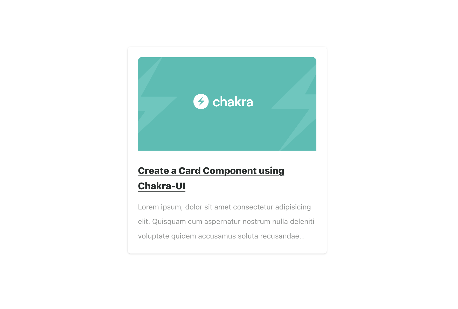
And voila, we've just made a clean-looking Card Component with little to no stress using Chakra-UI.
Conclusion.
In conclusion, this article aimed to scratch the surface and show the possibilities and ease that Chakra-UI offers. With tools like this, Engineers and companies can build and ship products faster and improve all-round productivity.
Feel free to check out the code of this article here and leave a star if you want 😁: https://github.com/EmmanuelOloke/chakra-article-card
Related Resources
What is Chakra-UI - Chakra UI Documentation
WAI-ARIA Guidelines - WAI-ARIA Overview
Article Code - GitHub Repo


