Introduction
Data visualization tools are powerful for analyzing and communicating complex data sets in a more accessible and intuitive way. With the advent of modern web technologies, creating interactive data visualizations has become easier than ever before.
React and Chart.js are two popular technologies developers can use to create dynamic and interactive data visualizations.
React is a widely-used JavaScript library for building user interfaces. Its component-based architecture and declarative syntax make it easy to create reusable UI components and manage complex states.
Chart.js is a popular, flexible, and easy-to-use open-source JavaScript library for creating responsive and customizable charts and graphs. Created and announced in 2013, it has ~60,000 Github stars and about 2.4 million weekly NPM downloads.
In this article, we will build a simple single-page application (SPA) to showcase how Chart.js can be used with React to create Line, Bar, and Pie Charts.
Prerequisite
Before we proceed, basic knowledge of JavaScript and React is required to grasp the concepts discussed in this article fully.
Come along and let's build together!
Project Setup
We start by first creating a new react application by running this NPM command:
npx create-react-app react-chartjs
This creates a new project folder react-chartjs with all the necessary files needed for a react application to run smoothly, then we proceed to remove all unnecessary files until we have a folder structure that looks like this:

Using ChartJS
After setting up our project, we now have to install the necessary packages to make Chart.js work in React. For that, we need to install two NPM packages. First, the chart.js package, which provides us with a set of frequently used chart types, plugins, and customization options that can be used for any type of application, not just react applications. And secondly, we need to install the react-chartjs-2 npm package, which is a wrapper for Chart.js in React applications and provides us with easy-to-use Chart.js components tailor-made for React.
To install these two packages, we run the following command:
npm install chart.js react-chartjs-2
After installation, the chart can not exist independently without some form of dataset being fed into it. Let's proceed to create this data file.
For the sake of this tutorial, we will create a dummy and random set of data that shows the customer gains and losses of an online business over a period of years.
To achieve this, in the src folder create a new file called data.js and populate it with the following code:
export const CustomerData = [
    {
        id: 1,
        year: 2017,
        customersLost: 820,
        customersGained: 60000
    },
    {
        id: 2,
        year: 2018,
        customersLost: 435,
        customersGained: 35000
    },
    {
        id: 3,
        year: 2019,
        customersLost: 565,
        customersGained: 48000
    },
    {
        id: 4,
        year: 2020,
        customersLost: 230,
        customersGained: 50000
    },
    {
        id: 5,
        year: 2021,
        customersLost: 120,
        customersGained: 40000
    },
];
Now that we have some data to work with, we can proceed to create the charts.
Creating the Bar Chart
A Bar Chart is a common statistical and data visualization tool. It is used to compare multiple datasets and to show trends in data side by side, represented by vertical bars. The react-chartjs-2 library exports a component Bar that is used for this purpose.
In the src folder, we will create a new folder components that will house all our component files for this project. Inside the components folder, create a new file, and name it BarChart.js then add the following code to the file.
import React from 'react';
import { Bar } from 'react-chartjs-2';
import { Chart, BarController, BarElement } from 'chart.js/auto';
import { CustomerData } from '../data';

Chart.register(BarController, BarElement);

const BarChart = () => {
  const data = {
    labels: CustomerData.map((data) => data.year),
    datasets: [
      {
        label: 'Cutomers Gained',
        data: CustomerData.map((data) => data.customersGained),
        backgroundColor: ['#4FD1C5', '#E9D8FD', '#FC8181', '#F3BA2F', '#2A71D0'],
      },
    ],
  };

  return (
    <div>
      <h1 style={{ color: '#319795' }}>Bar Chart</h1>
      <Bar data={data} />
    </div>
  );
};

export default BarChart;
Let's walk through this code:
We start by importing React from react which is typical for every React file. Then we imported the Bar component as a named export from react-chartjs-2 to give us access to the Chart.js Bar component tailored for React. We import Chart, which is the main Chart.js class from the special chart.js/auto path. It loads all available Chart.js components and also provides the register method, which we will use to register the BarController and BarElement classes that are required for the Bar component to be fully rendered. If this is not done, we get some errors in the console about some variables not being registered, so it's quite essential.
We proceed to create the BarChart ES6 functional component, and in there, we declare the data object. This is a Chart.js requirement as it holds the data and specifications that will be passed to the Chart.js Bar component to enable it to render the necessary data.
The data object takes in some properties, labels and datasets respectively. The labels consists of the information we want to show on the x-axis of the BarChart, which must be an array. In our case, this will be the year in review as specified in the CustomerData variable in our data.js file. We can extract the individual year into an array by simply running the javascript map function on the CustomerData variable and returning data.year value.
The datasets property also takes in an array of object with several properties. This is where the configuration and customization of the Bar Chart happens. Numerous properties can be set here depending on the developer's preference, but for the sake of this article, we're only going to use the necessary and needed ones. The label property takes in a string that serves as a title for the Chart, the data property like the labels property discussed in the previous paragraph also takes in an array containing the set of data that will be represented on the y-axis, which in our case, is the number of customers gained by the business as given in our data.js file, for this, we can also run a map function again on the CustomerData array, but this time return the data.CustomerGain value.
We can specify different background colors for each bar in the Bar Chart through the backgroundColor property. It takes in an array of color codes. The color code can be in various formats like color name, hex codes, or RGB values, the choice is yours. If only one color is specified, it will be applied to all the bars in the chart, and if two colors are specified, it will be alternated through the bars. Since we have a small dataset of only five elements, we can afford to set colors for each bar individually.
Finally, we return our JSX element, which is a div with a h1 tag for the chart heading, and the Bar component that takes in a prop called data and in there, we pass the data variable. Then we export the BarChart component as a default export to be imported and used elsewhere in our app.
And with that, the BarChart component is done. We can then go into our App.js file and render it with the following code:
import './App.css';
import BarChart from './components/BarChart';

function App() {
  return (
    <div className="App" style={{ display: 'flex', flexDirection: 'column', alignItems: 'center' }}>
      <div style={{ width: '60vw', marginBottom: '2em' }}>
        <BarChart />
      </div>
    </div>
  );
}

export default App;
In the code above, we import the BarChart component we've just created and render it so it can be visible in the browser.
We also added some inline styles to display and align things in place properly.
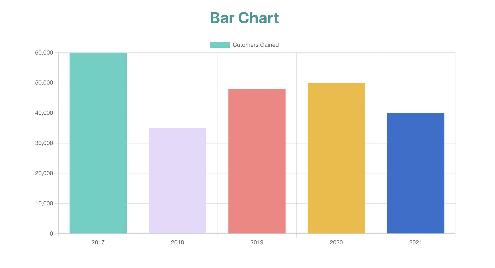
Way to go! Now when we view the project in the browser, we should have something like this:

And with that, we have successfully implemented the Chart.js Bar Chart.
In this article, I also want to show how we can use the line and pie charts from Chart.js. To do this, we will follow an identical approach to what we did with building the bar chart, with just a few changes. Come along as we explore them together.
Creating the Line Chart
A line chart is another type of data visualization tool, it is essentially a graph where intersections denote the data points on the x and y axis, and a line is drawn through them.
For the line chart, we will use another set of random data. This data represents an individual's account balance through the months of a year. So we add the following code to our data.js file:
export const BalanceData = [
  {
    id: 1,
    month: 'Jan',
    balance: 500,
  },
  {
    id: 2,
    month: 'Feb',
    balance: 300,
  },
  {
    id: 3,
    month: 'Mar',
    balance: 400,
  },
  {
    id: 4,
    month: 'Apr',
    balance: 500,
  },
  {
    id: 5,
    month: 'May',
    balance: 800,
  },
  {
    id: 6,
    month: 'Jun',
    balance: 650,
  },
  {
    id: 7,
    month: 'Jul',
    balance: 700,
  },
  {
    id: 8,
    month: 'Aug',
    balance: 690,
  },
  {
    id: 9,
    month: 'Sep',
    balance: 1000,
  },
  {
    id: 10,
    month: 'Oct',
    balance: 1200,
  },
  {
    id: 11,
    month: 'Nov',
    balance: 1050,
  },
  {
    id: 12,
    month: 'Dec',
    balance: 1300,
  },
];
We create the line chart by first creating a component for it. In the components folder, create a new file named LineChart.js and in there, add the following code:
import React from 'react';
import { Line } from 'react-chartjs-2';
import { BalanceData } from '../data';

import { Chart, LineElement } from 'chart.js';

Chart.register(LineElement);

const LineChart = () => {
  const data = {
    labels: BalanceData.map((data) => data.month),
    datasets: [
      {
        label: 'My Balance',
        data: BalanceData.map((data) => data.balance),
        lineTension: 0.5,
        backgroundColor: '#9F7AEA',
        borderColor: '#9F7AEA',
        pointBorderColor: '#B57295',
        pointBackgroundColor: '#fff',
        pointBorderWidth: 1,
        pointHoverRadius: 5,
        pointHoverBackgroundColor: '#D6BCFA',
        pointHoverBorderColor: '#D6BCFA',
        pointRadius: 3,
      },
    ],
  };

  return (
    <div>
      <h1 style={{ color: '#805AD5' }}>Line Chart</h1>
      <Line data={data} />
    </div>
  );
};

export default LineChart;
Just like we did in the BarChart.js file, we import React from 'react', but this time around, we import the Line component from the react-chartjs-2 library instead, this is the main Line component provided by Chart.js and it is what we will use to render the chart at the end. We then proceed to import the newly added BalanceData variable from our data.js file. Finally, for the imports, we import the Chart and the LineElement classes from the chart.js library and register them in the following line, similar to what we did while creating the BarChart component.
After all the imports are settled, we then proceed to create the ES6 functional component for the LineChart component. We declare the data variable as an object with labels and datasets properties respectively. For the labels property, as we did before, we map over the BalanceData array and extract out the data.month values to be used on the x-axis of the chart. For the datasets property, it takes in an array of object and in there, we specify the chart title with the label property as a string 'My Balance' and the data property which also takes in an array, and to get the desired data, we map over the BalanceData array again and extract the data.month values. To further customize the appearance of the line chart, there are several other properties provided by Chart.js that you can set. I've chosen to set some in this project, including the lineTension, backgroundColor, pointRadius, pointBorderColor, pointHoverBackgroundColor, etc. You can learn more about all the other properties provided by Chart.js in their official documentation.
Finally, we return a JSX element containing a h1 header for the title, and the Line component, which takes a data prop, and we then pass the data variable into it. After that, we export the LineChart as default from the file to be used in other parts of the app. And with that, we are done with the line chart.
To render the beautiful line chart we have just created, we need to edit our App.js file and add the following code to it:
import './App.css';
import BarChart from './components/BarChart';
import LineChart from './components/LineChart';

function App() {
  return (
    <div className="App" style={{ display: 'flex', flexDirection: 'column', alignItems: 'center' }}>
      <div style={{ width: '60vw', marginBottom: '2em' }}>
        <BarChart />
      </div>
      <div style={{ width: '60vw', marginBottom: '2em' }}>
        <LineChart />
      </div>
    </div>
  );
}

export default App;
As we've done before, we import the LineChart component we just created and render it in our JSX with additional inline styling for proper display and alignment.
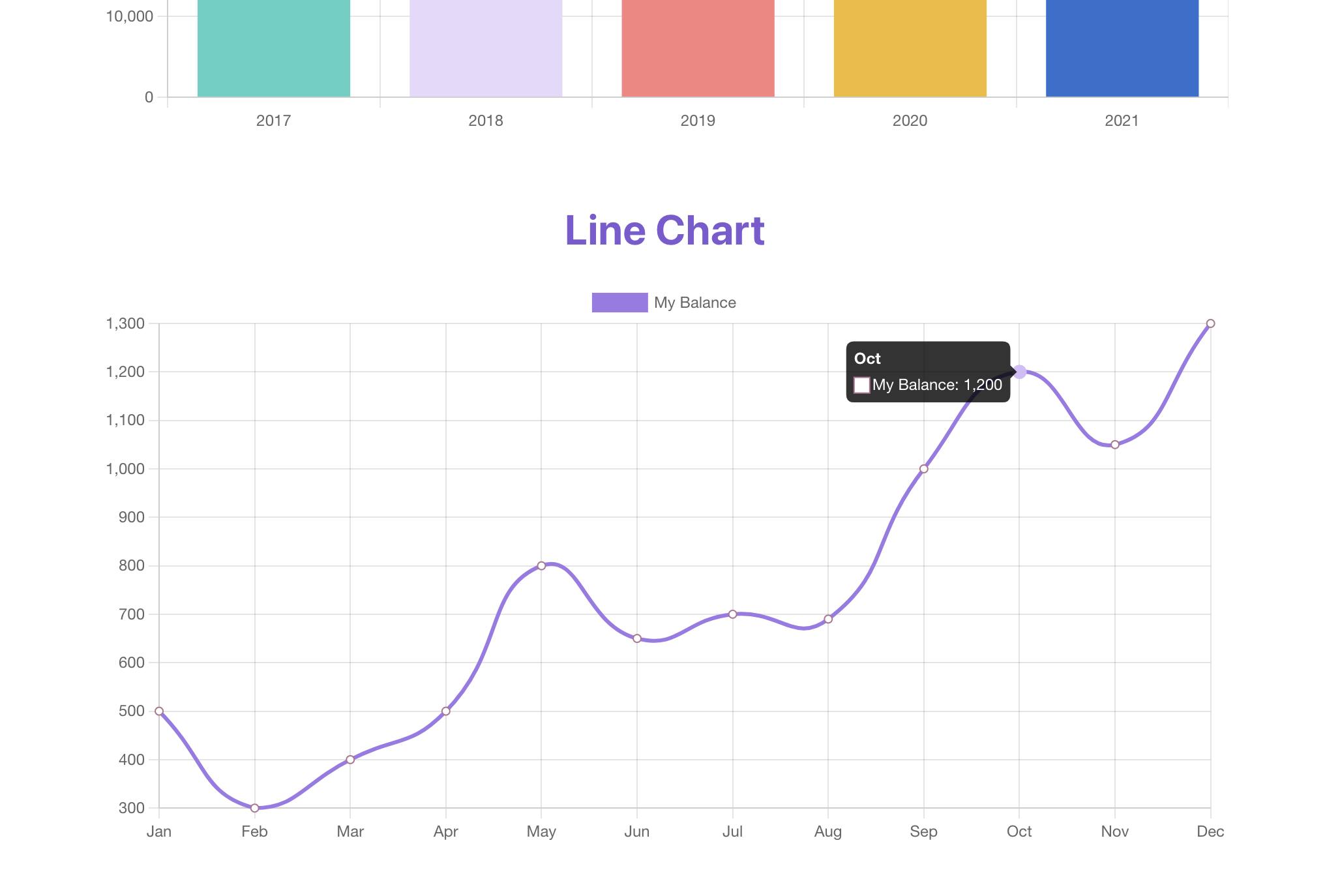
Now if we view our app in the browser to check our progress so far, we see our creation, and it looks like this:

Beautiful. And it's interactive also, as you can hover over a data point to reveal more detailed information.
Now let's move on to the last chart in this article.
Creating the Pie Chart
Way to go. One more chart, and we are done. If we've learned anything from the previous two charts, then this next one should be a piece of "pie" for us, right?😉
The pie chart is another familiar data visualization tool. Data is segmented into different slices varying in size depending on their quantity or importance.
To create a pie chart using Chart.js, we will reuse the same data we used for the bar chart as shown earlier in this article, but this time, we will use the pie chart to showcase the customer loss of the business.
Let's go into our src folder and create a new component named PieChart.js, then add the following code in there:
import React from 'react';
import { Pie } from 'react-chartjs-2';
import { CustomerData } from '../data';

const PieChart = () => {
  const data = {
    labels: CustomerData.map((data) => data.year),
    datasets: [
      {
        label: 'Cutomers Lost',
        data: CustomerData.map((data) => data.customersLost),
        backgroundColor: ['#4FD1C5', '#E9D8FD', '#FC8181', '#f3ba2f', '#2a71d0'],
      },
    ],
  };

  return (
    <div>
      <h1 style={{ color: '#0BC5EA' }}>Pie Chart</h1>
      <Pie data={data} />
    </div>
  );
};

export default PieChart;
For the pie chart, not a lot of imports are needed. We just import React, Pie, and CustomerData from 'react', react-chartjs-2, and data.js respectively. Then we proceed to create our ES6 functional component, named PieChart. We declare the data object, and for the labels property, we map over the CustomerData array and extract the data.year values into a new array to display the years represented in the pie chart and create a set of keys for the chart. For the datasets property, we pass in the array of object and give the label property the string 'Customers Lost', this shows up on a label when you hover over each slice of the pie along with other data. Then for the data property, we map over the CustomerData array and return the data.customersLost values in a new array, and then we specify colors for each slice of the pie with the backgroundColor property, just like in the other types of charts we've built so far in this article.
Finally, we return a JSX element div containing a h1 heading with color inline styling and the Pie component, which takes a data prop, and we pass the data object to it. In the end, we export the PieChart component as default to be used in other places in our app.
We are now almost done. The last thing to do now is to render our newly built pie chart in the browser so we can see the beauty we've just created. To do that, we go into the App.js file and edit the code, so it looks like this:
import './App.css';
import BarChart from './components/BarChart';
import LineChart from './components/LineChart';
import PieChart from './components/PieChart';

function App() {
  return (
    <div className="App" style={{ display: 'flex', flexDirection: 'column', alignItems: 'center' }}>
      <div style={{ width: '60vw', marginBottom: '2em' }}>
        <BarChart />
      </div>
      <div style={{ width: '60vw', marginBottom: '2em' }}>
        <LineChart />
      </div>
      <div style={{ width: '600px', marginBottom: '2em' }}>
        <PieChart />
      </div>
    </div>
  );
}

export default App;
As we now already know, all we need to do is to import the PieChart component from our components folder and render it in our JSX with some styling to make it display pleasantly.
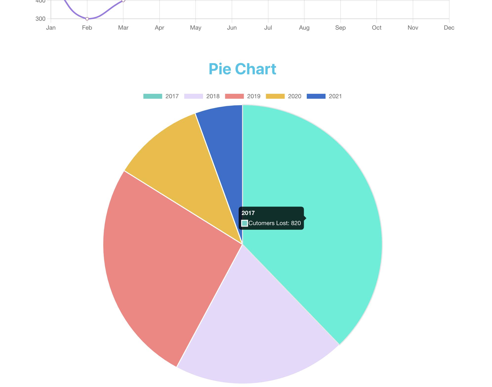
If we now check it out in the browser, this is what the result looks like:

And voila!! We now have this beautiful pie chart representing our data more pleasantly and intuitively.
Conclusion
Pheew, that was a lot, right? Thanks for sticking through to this point. This article aimed to demonstrate in a practical way how easy it can be to visually represent data in our React apps using awesome tools like Chart.js.
I understand that out in the real world, there may be the need to represent a lot more complex sets of data, and for that, Chart.js also provide other types of charts not discussed in this article, such as; bubble chart, radar chart, scatter chart, doughnut chart, etc. please check out the official documentation for a complete understanding of how they can be implemented should you need to, building on the concepts learned in this article.
I hope this article has been worth your time and that I've been able to impact knowledge through it. See you in the next one. Cheers ✌🏽
Bonus tip
Sometimes as developers, we get presented with data in a CSV file, and it's our responsibility to extract those data into a meaningful format we can more conveniently work with, like JSON.
One fantastic resource I came across while researching for this article was this website: https://csvjson.com/csv2json for converting any CSV file into JSON just with a few clicks. All you need to do is upload the CSV file, click Convert, and it spits out a nice JSON format for you. Do check it out and save yourself some headaches. You're welcome 😉
References
Chart.js Documentation - https://www.chartjs.org/docs/latest/
React ChartJS 2 Documentation - https://react-chartjs-2.js.org/
Code for the App - https://github.com/EmmanuelOloke/react-chartjs
Bonus Resource - https://csvjson.com/csv2json
